EQUANS CHARGING
EQUANS CHARGING
Designing the Next Current
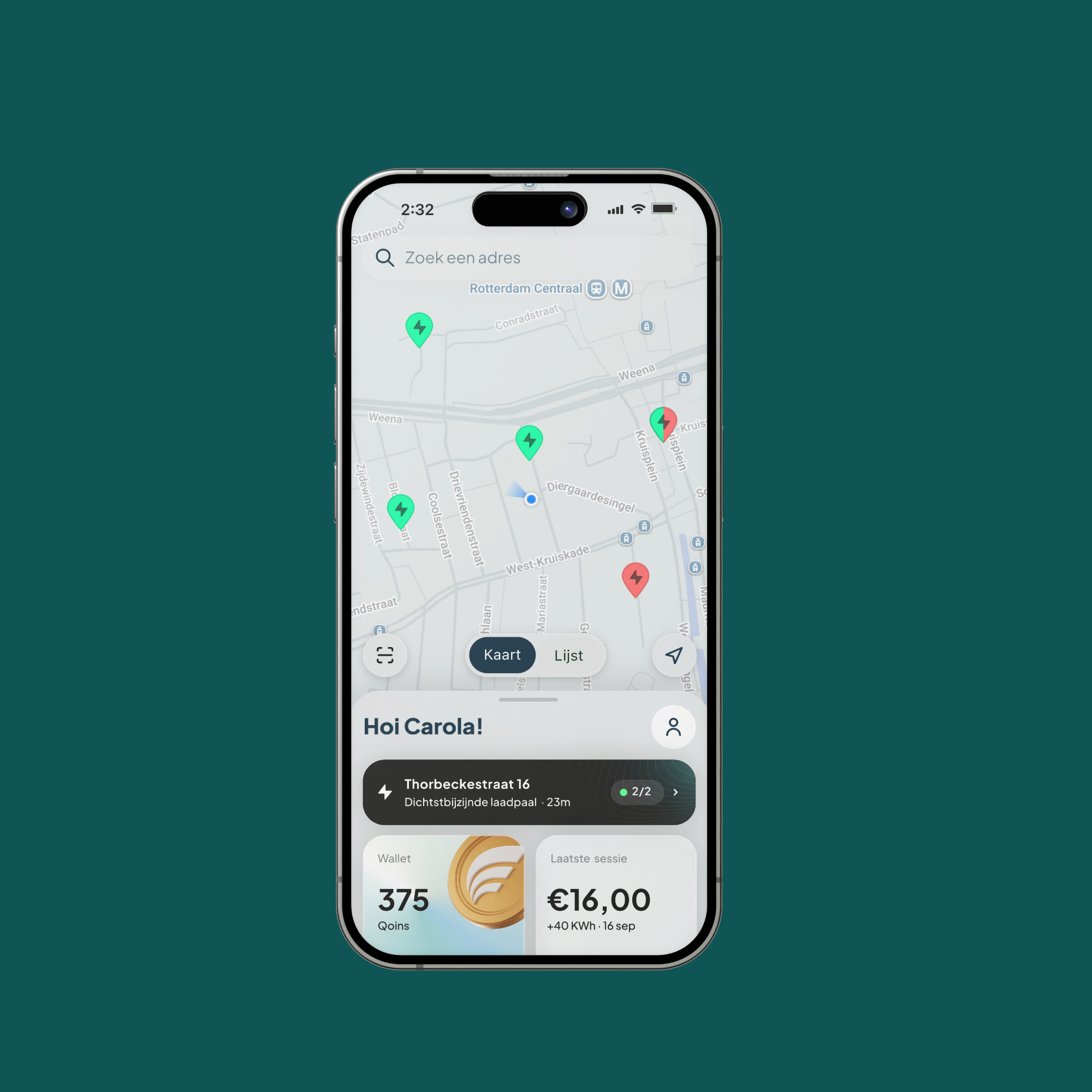
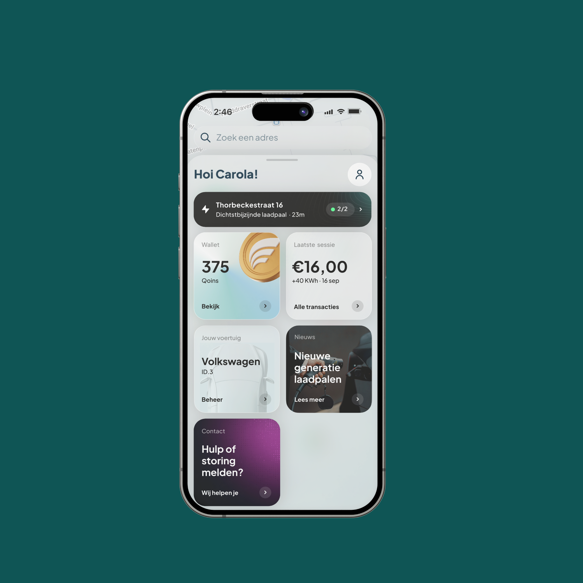
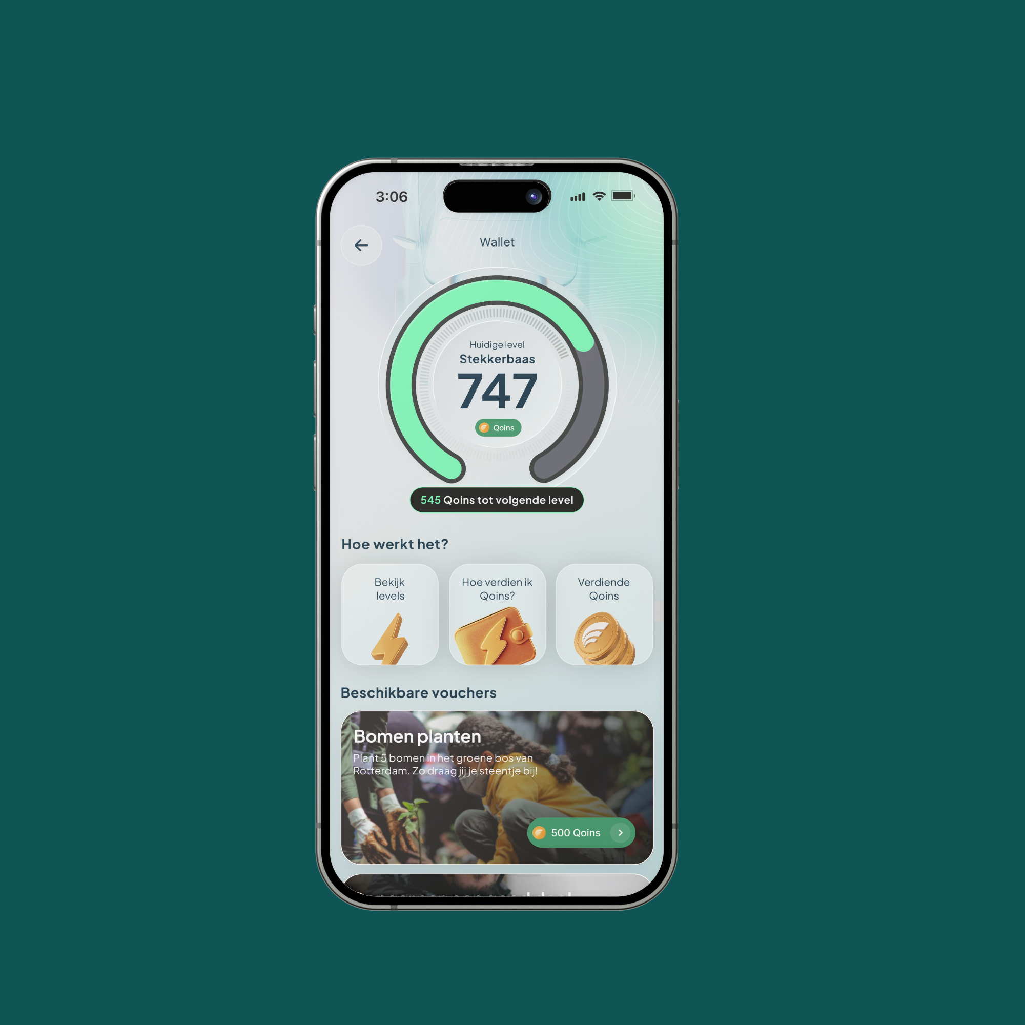
Creating a look and experience that reflects the fast pace of EV innovation while staying grounded in the accessibility and usability people expect from a tool they rely on daily.
Client
Equans
Agency
Framna
Year
2025
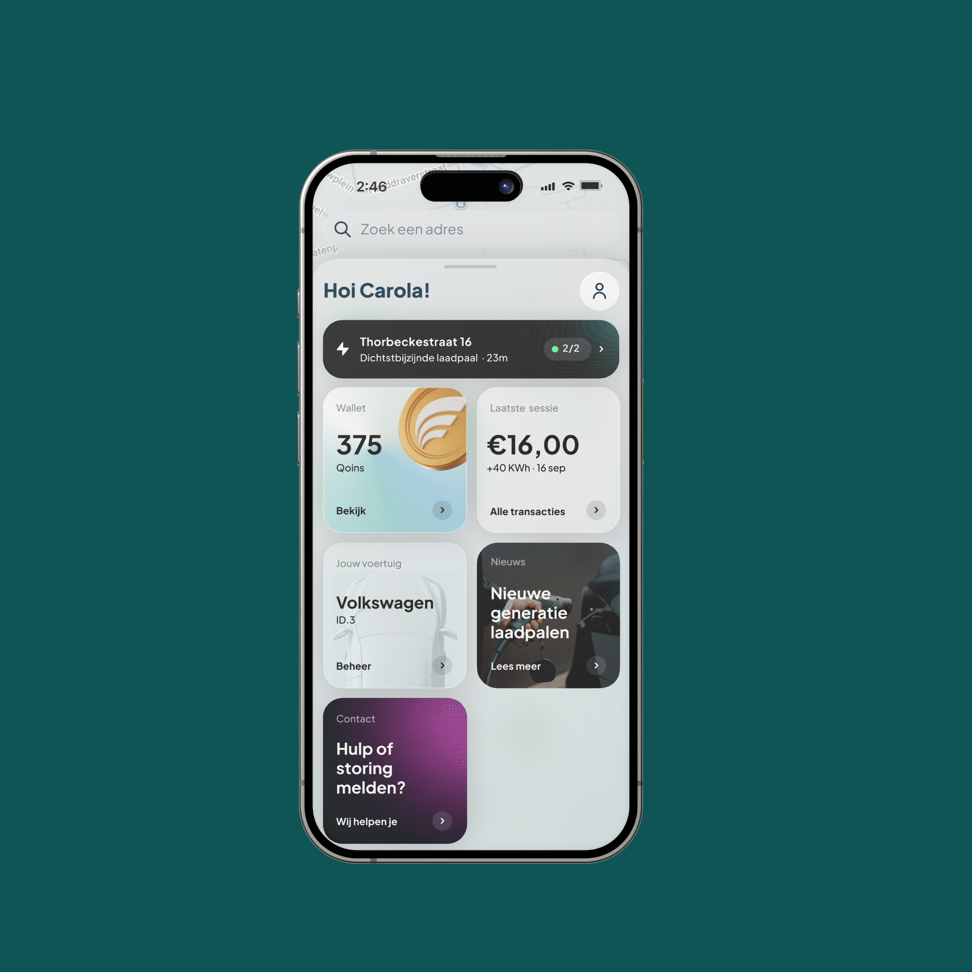
Concept and Theme Development:
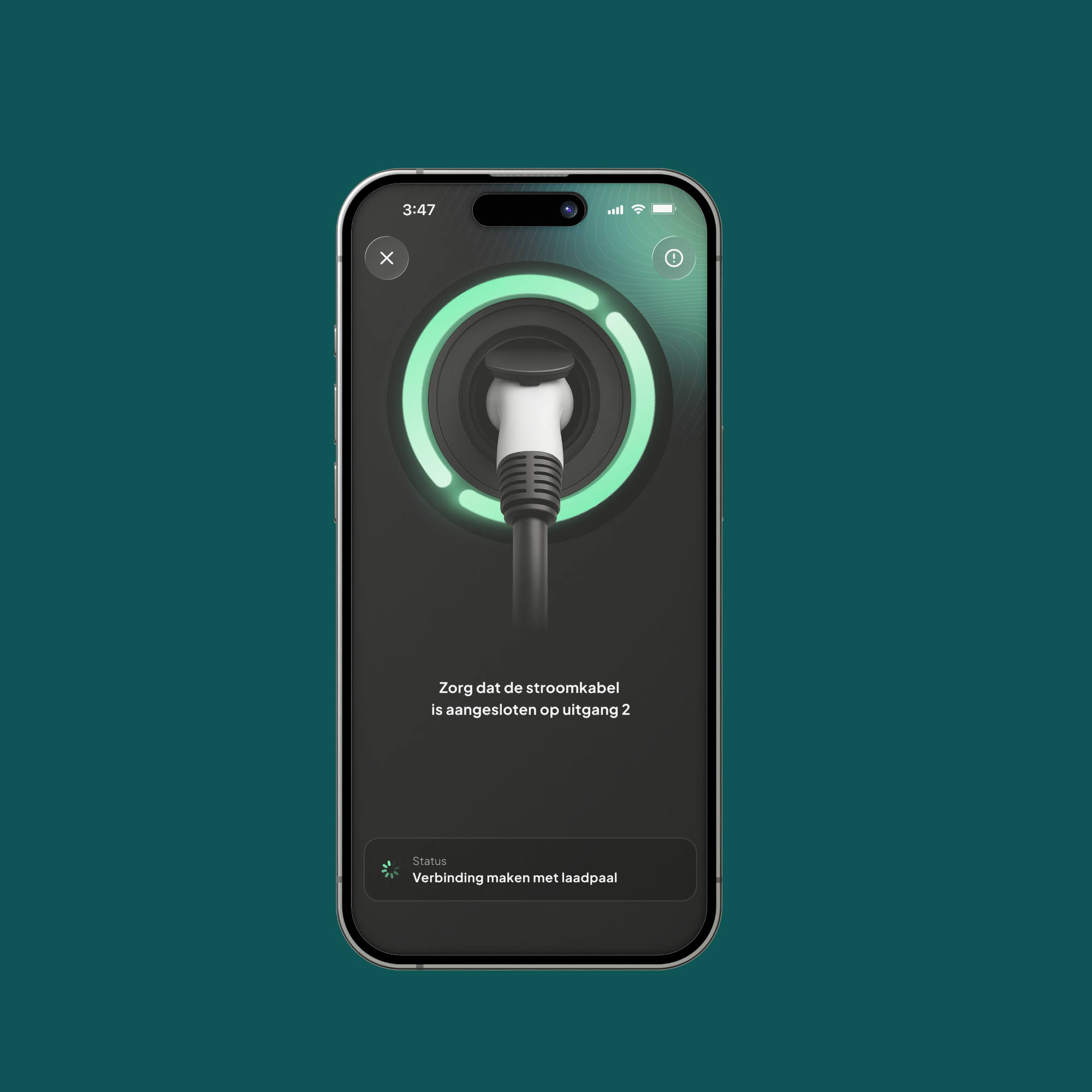
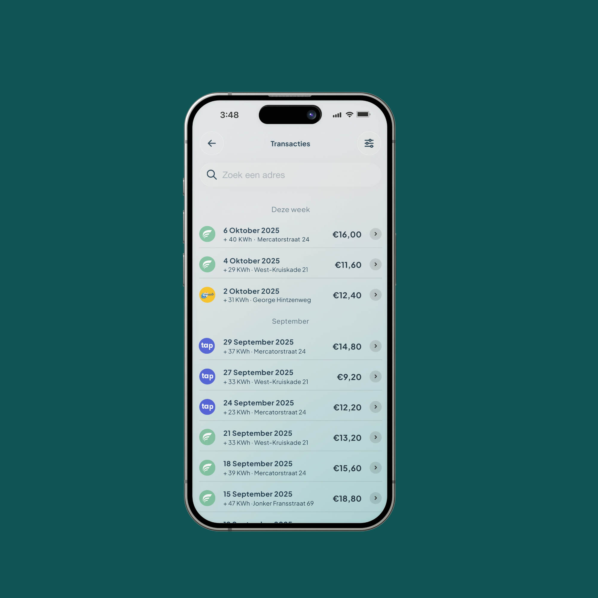
For the Equans Charge App rebrand, I approached the identity as a bridge between where EV infrastructure is headed and where everyday users already feel comfortable. Rather than starting from a blank slate, I grounded the new visual language in familiar interaction patterns and clear, legible typography, so returning users could adapt instantly while new users felt no learning curve.
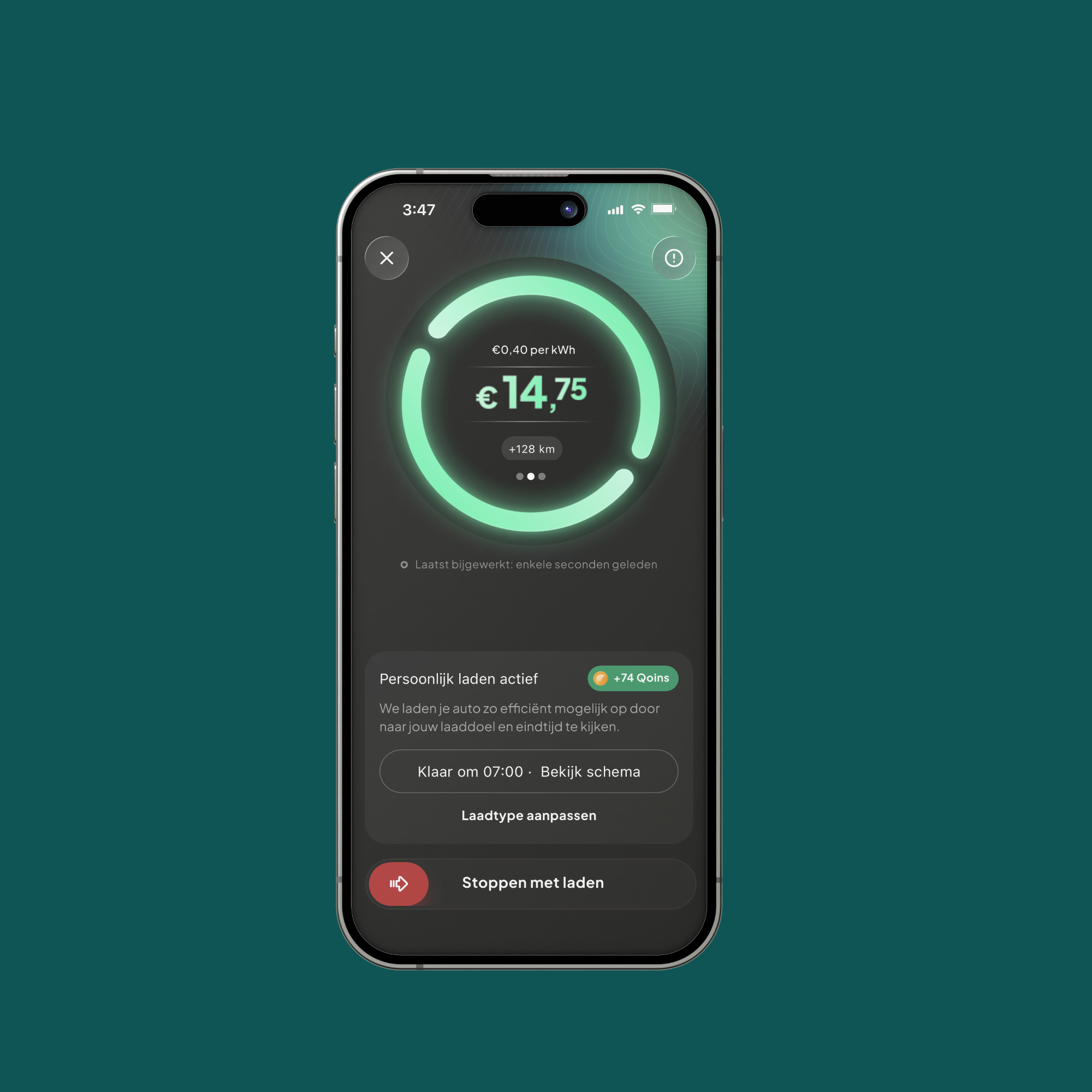
Process:
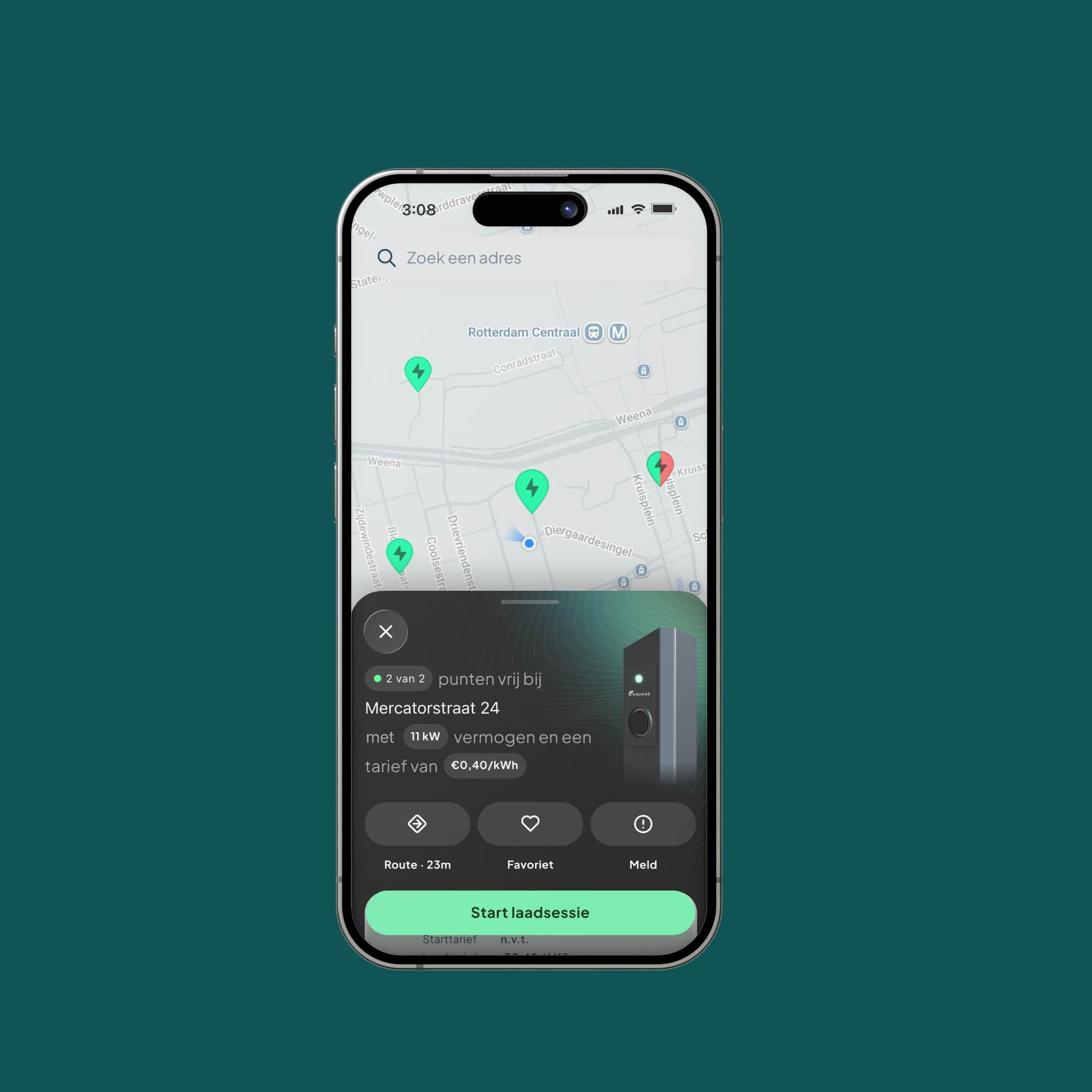
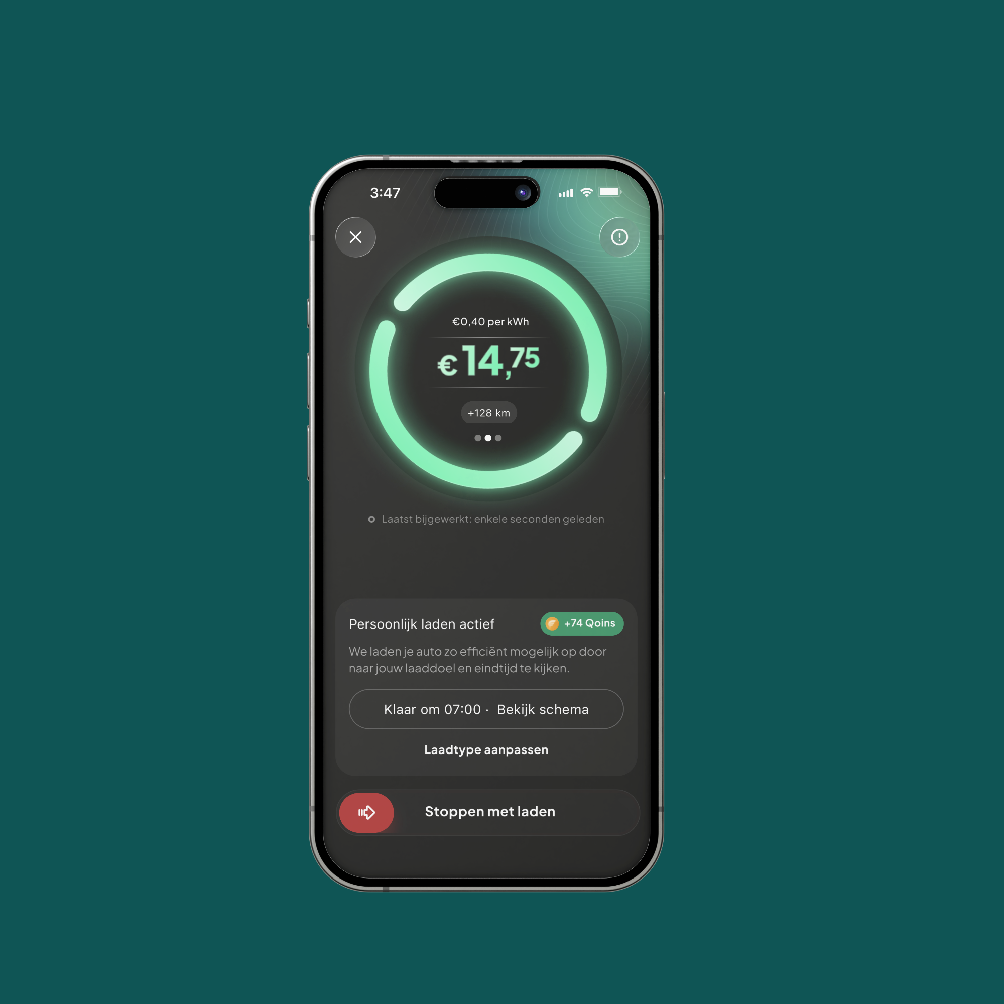
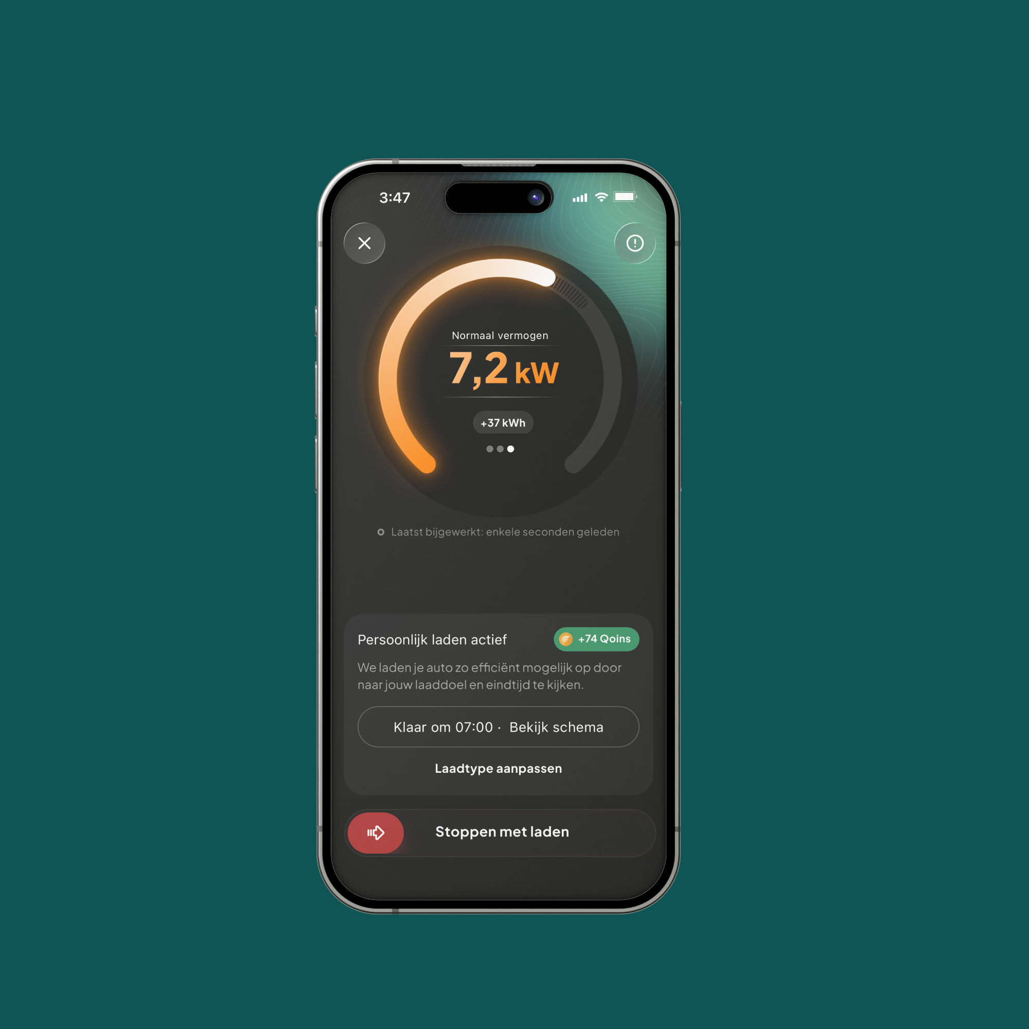
I layered in a more future-forward aesthetic, a refined color palette, dynamic charging-state visuals, and subtle motion cues to signal innovation and reflect the app's role in a fast-evolving energy ecosystem. The goal throughout was balance: a brand that feels ahead of its time without sacrificing the accessibility and usability people rely on every time they plug in.
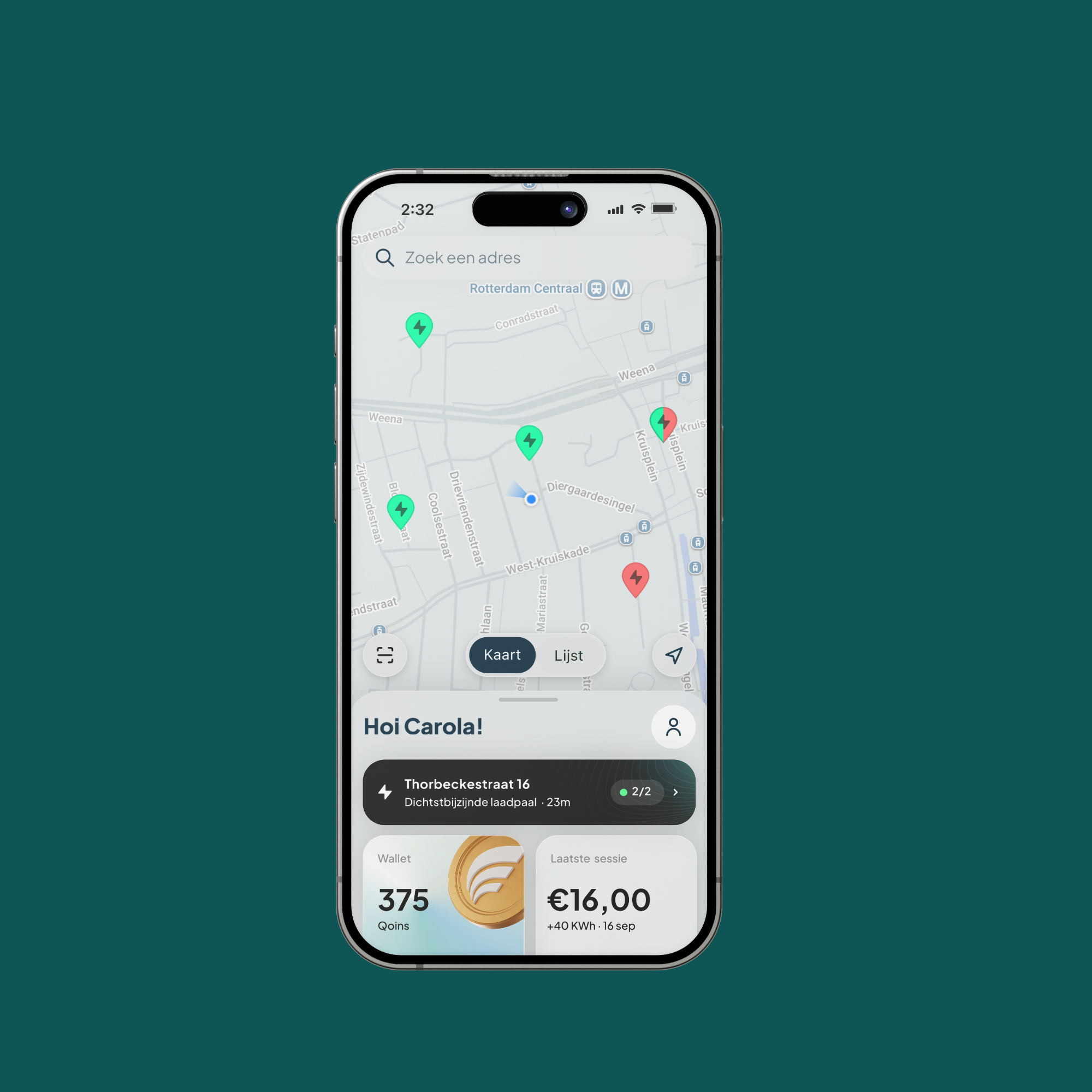
Outcome
A rebrand that positions Equans as a confident, modern player in the EV space without alienating everyday drivers. Early impressions point to smoother onboarding and quicker recognition of key actions like starting or stopping a charge, thanks to the balance struck between bold visual updates and familiar UI conventions. Ultimately, the new branding doesn't just look ahead it makes the everyday experience of charging feel simpler, more trustworthy, and more aligned with where the industry is heading.